 cwynn
cwynnThe CTW mark
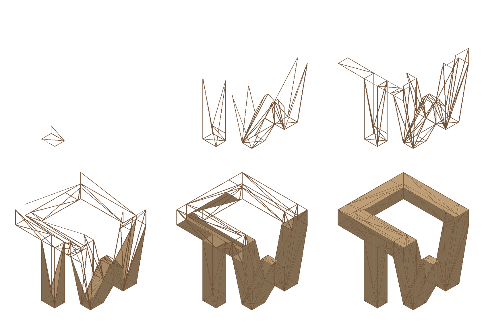
I've been working on a logo for this site: my initials, C-T-W, as one connected 3D solid. It started from a flat logo I drew myself — and I kept trying to get AI to pull it into a 3D model, with no luck. So instead, AI and I built two tools to fill the gap: one to nail down the exact geometry, one to animate it. The result is the little animation in the navbar up top. It plays once per page and holds on the solid.
The original
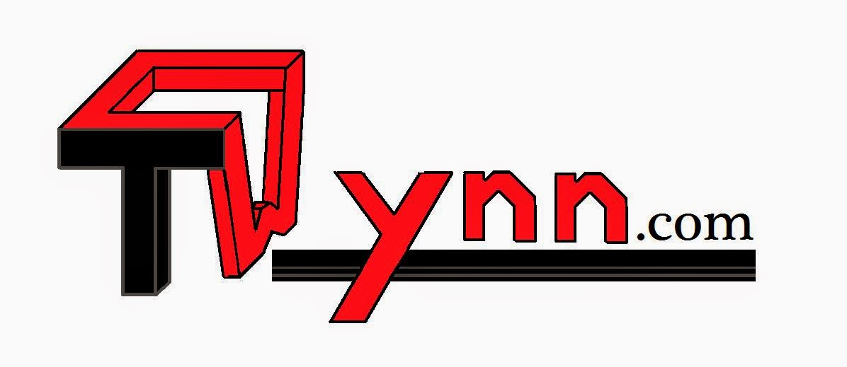
This is the 2D mark I started from: flat lettering for cwynn.com, with a blocky 3D-style T and W. I wanted it as a real solid object, not a flat drawing, but every attempt to have AI turn it into 3D came back wrong — proportions off, letters disconnected, geometry that wouldn't hold together. Rather than keep fighting the model, we built tooling around the problem instead.
Locking down the shape
The solid-clay direction won early: one continuous block, no floating pieces, matte finish.
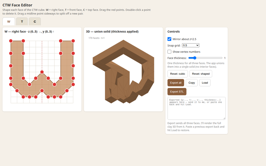
To get exact control I built a 2D face editor: w-shape-editor. Each letter is a flat polygon — W on the right face, T on the front, C on top — and the tool unions them into a single watertight solid at a given thickness. Drag the red points, and the 3D preview updates live.
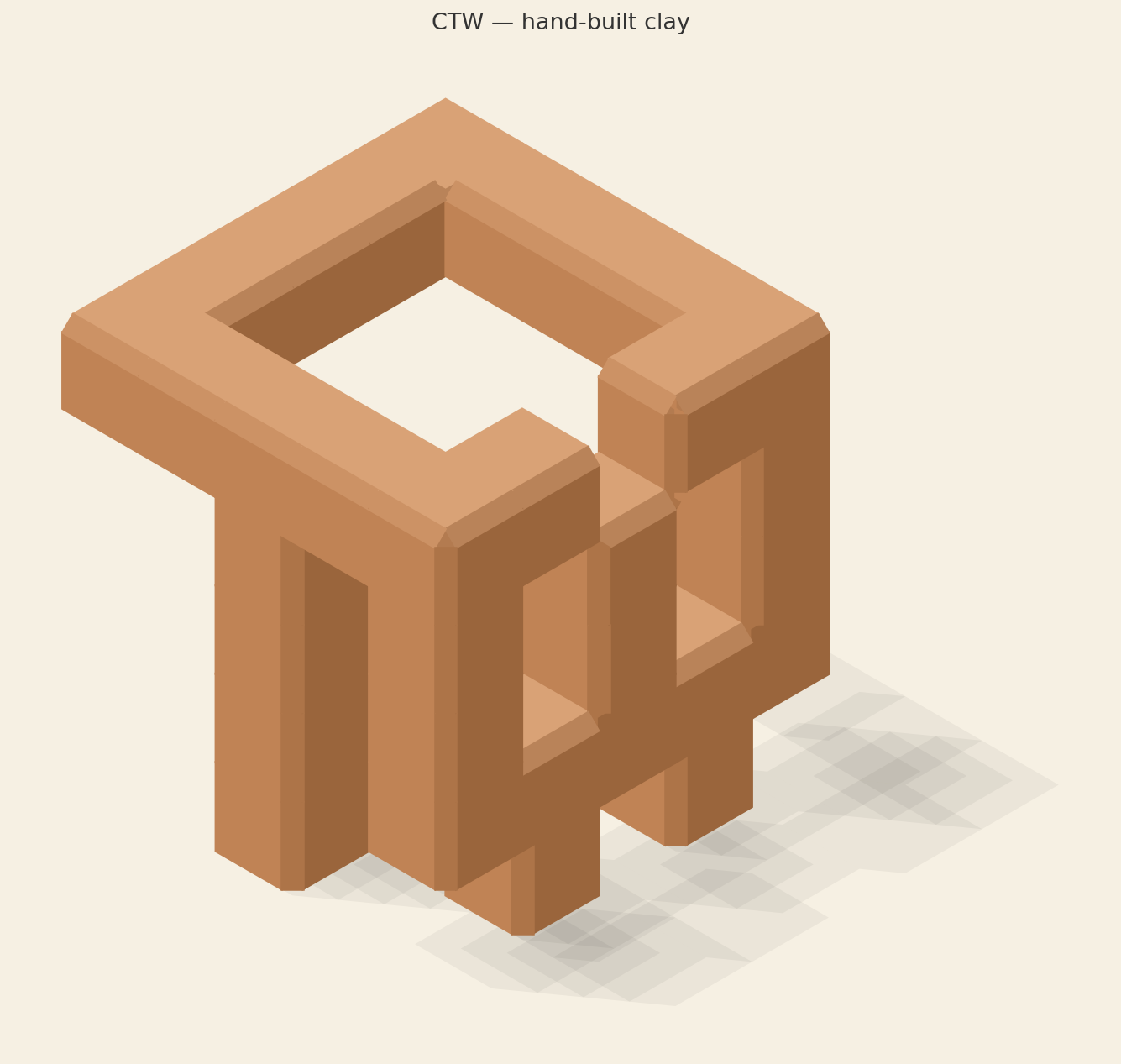
I exported the coordinates and settled on a thickness of 0.75. The flat-shaded studio render is the current still:
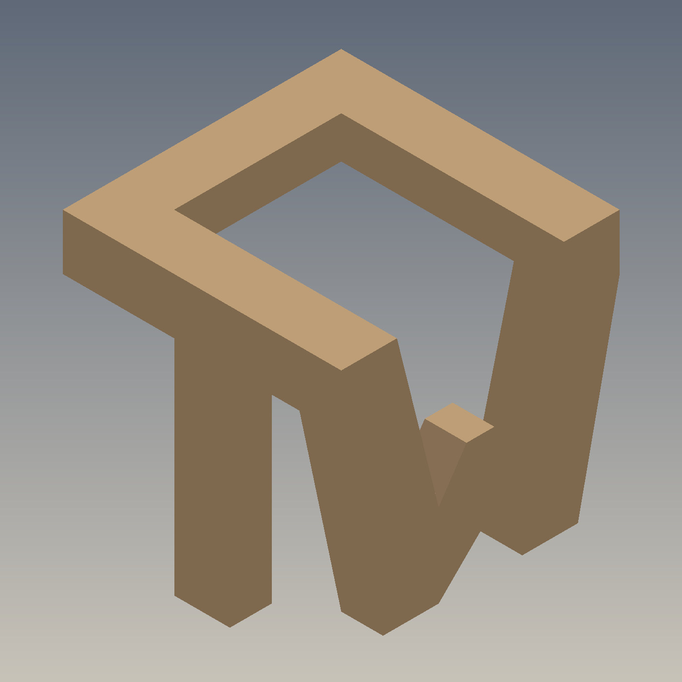
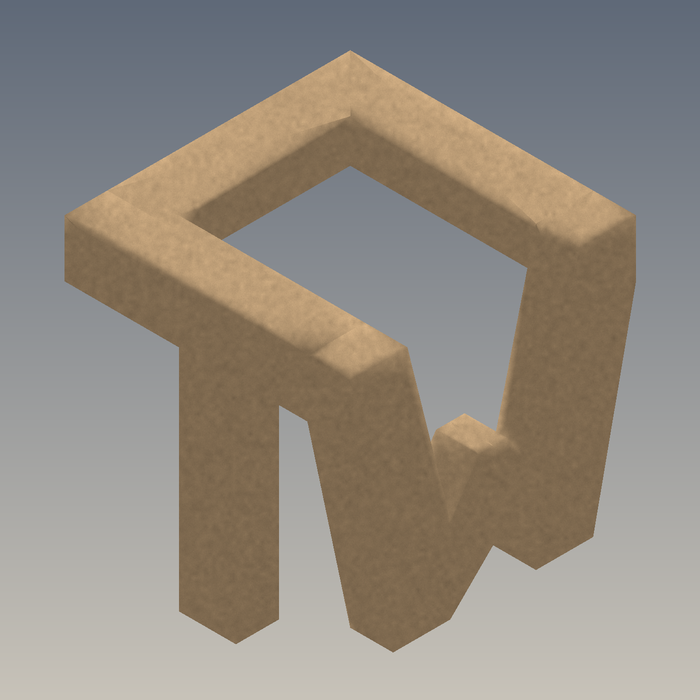
I also tried a rounded clay variant, but the pure flat-faced version is the one.
Animating it
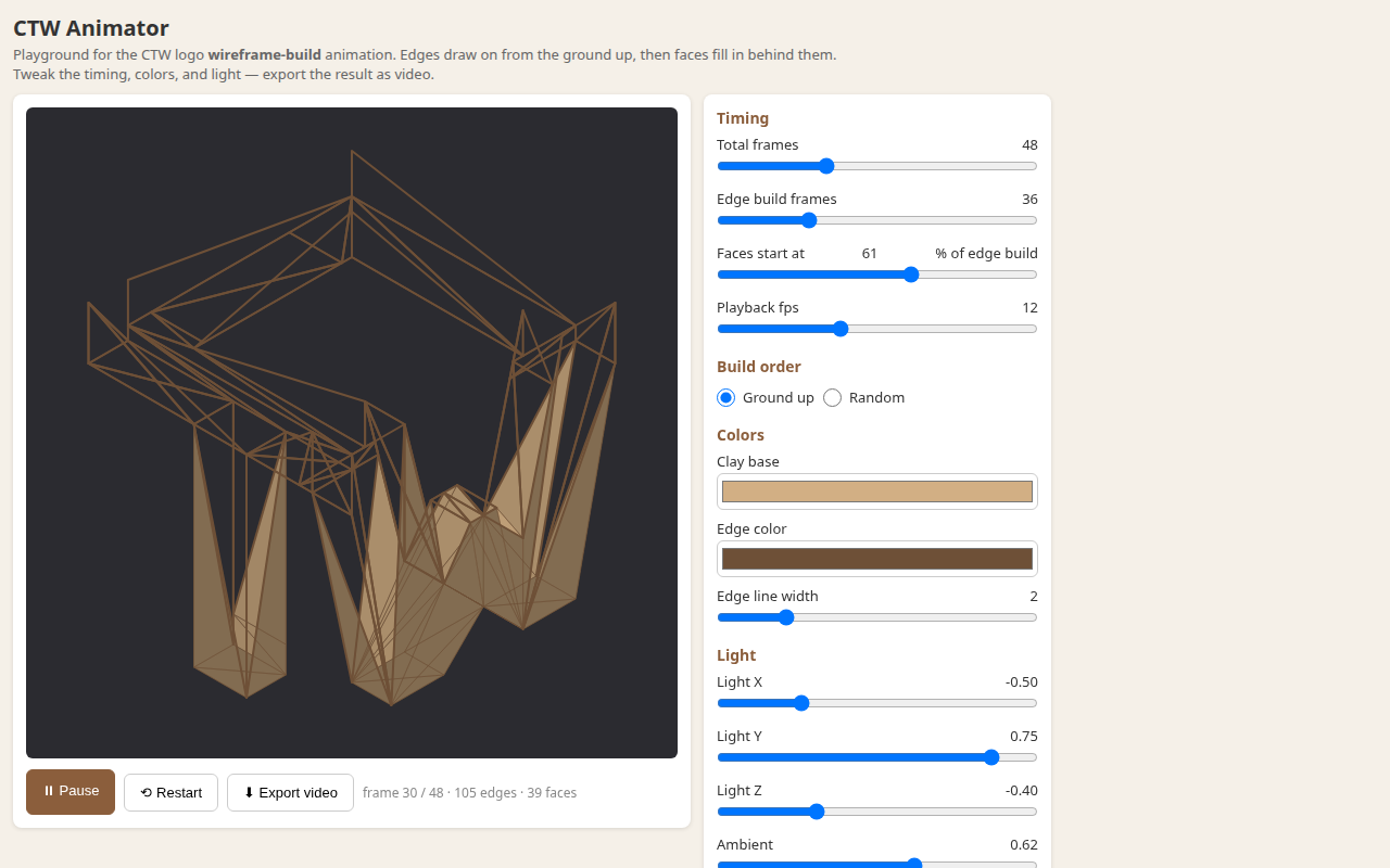
Then I wanted a build animation, so I made a second tool: ctw-animator (repo). It's a playground for the "wireframe builds, faces fill in behind it" animation — sliders for timing, build order, colors, and light direction, with video export.
The animations
The one I kept: edges draw from the ground up, and the faces start filling in a little past halfway through the wireframe, in the same bottom-up order.
The wire-built version is what's in the navbar now. Plays once, holds solid.